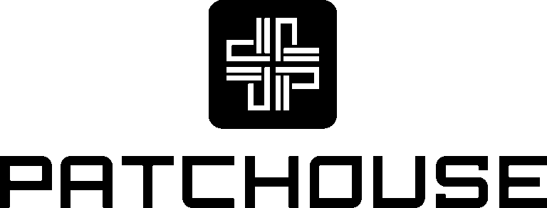
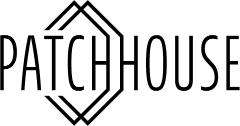
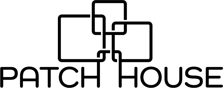
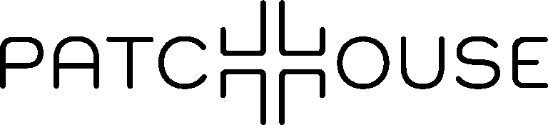
I created the logo for Patch House, a wellness-focused brand developing a new line of melatonin and caffeine patches designed to support better sleep and smoother wake-ups. With an open brief, I had the freedom to shape a visual identity that feels modern, calming, and purpose-led.
The final mark is a subtle reference to a cross – an enduring symbol of care and healing – reimagined through clean, geometric lines. This allowed the logo to convey trust and functionality while staying visually minimal and adaptable. The result is a modern, versatile logo built for use across packaging, digital platforms, and lifestyle applications.